Client
Unilever
Services
Strategic branding / VI / Packaging design / Marketing strategy
Year
2020
Design agency
Manyone
For a world of healthy lifestyle in motion, and a demand for businesses to be agile, an exclusive and extendable Swedish Glace/Choice brand experience is designed that’s inherently true to the brand heritage and can be applied through all digital platforms. An experience that resonates with a global audience and is born digital.
Close collaboration with Swedish Glace/Choice ’s teams in redesigning the corporate visual identity and brand strategy, including 5-year roadmap, brand guidelines, and implementation support. New brand identity and digital strategy released in the UK and Sweden.
Why are Swedish Glace/Choice revamping its brand?
Swedish Glace / Choice (SG/Choice) is Unilever’s sole plant-based ice cream brand, established in the UK and Sweden and targeting flexitarians, vegans, and dairy-intolerants. As plant-based diets grow, overcoming perceptions of poor taste and texture is crucial. Our goal is to rebrand SG/Choice as a progressive, high-quality option and expand our market reach. By 2025, we aim to make SG/Choice Unilever’s third-largest brand. This involves enhancing transparency and environmental commitments, improving brand visibility, and crafting a compelling narrative for both physical and digital platforms. We’ve conducted thorough market and competitor analysis to refine our marketing strategies and establish a resonant brand voice.

A refresh of the visual identity
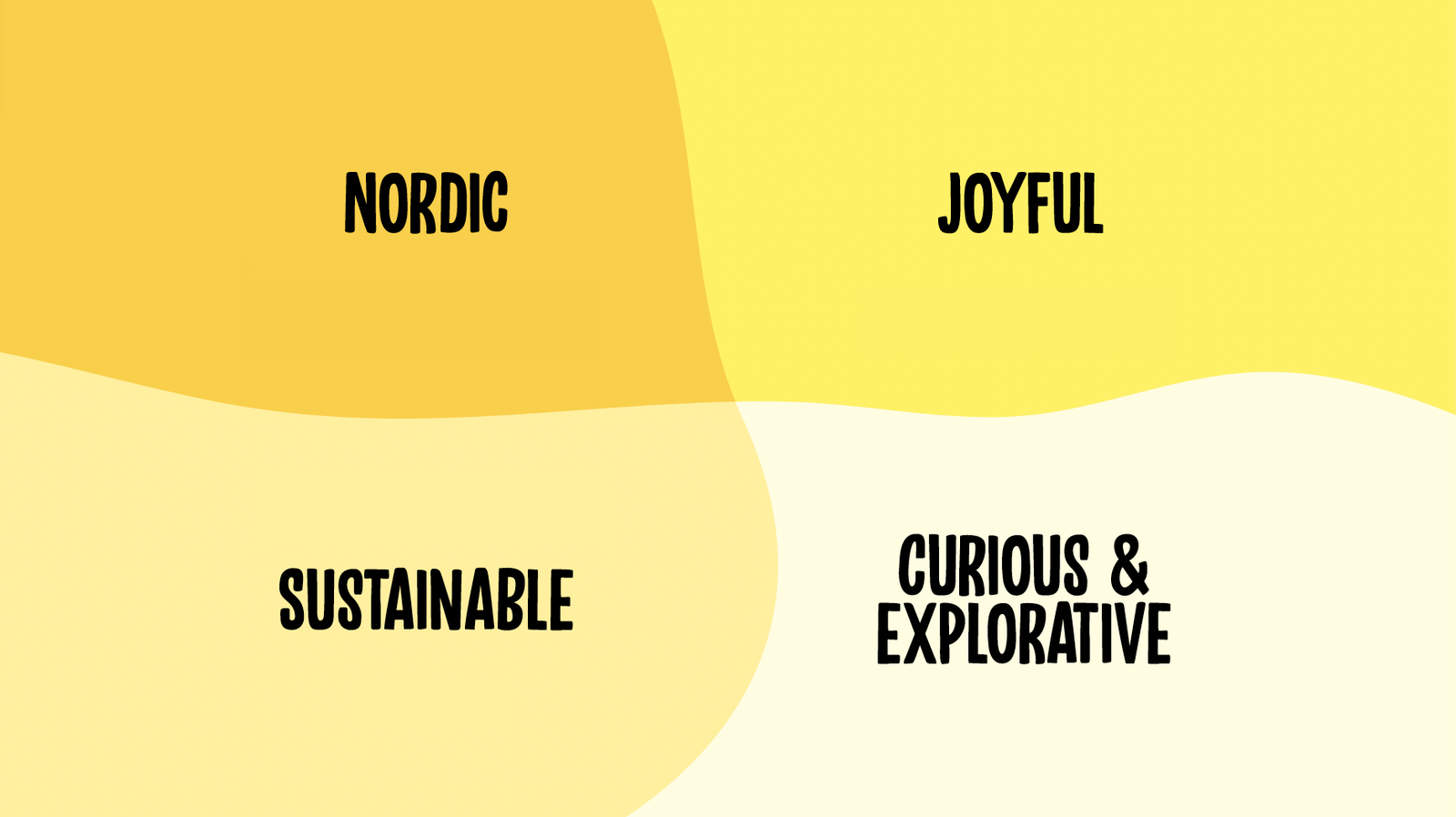
We have then shaped the brand story foundations by drafting below together with the stakeholders:
• Brand mission
• Golden circle
• Core values
• Brand experience principles
• Brand personality
Next step, we revamped the logo and redesigned the packaging design based on the findings from the competitor audit and product packaging audit.
Block colours and clean typography are the hero
It gives clarity and distinction to a brand within a busy space. SG/Choice’s octagonal shape is indeed the most memorable form, which is great. However, that does point towards a brand that is saying very little.
Elevate the brand to be more instantly recognisable, distinctive and memorable
Simplify the information processing for consumers, whilst communicating the key messages/claims within seconds. Consumers move fast, so we need to them to understand the key messages in seconds.
Work with the form factors to reduce wasted space and ensure brand consistency
Redesign for real-world context. Ensuring that the packaging is branded and communicative within all in-store scenarios.
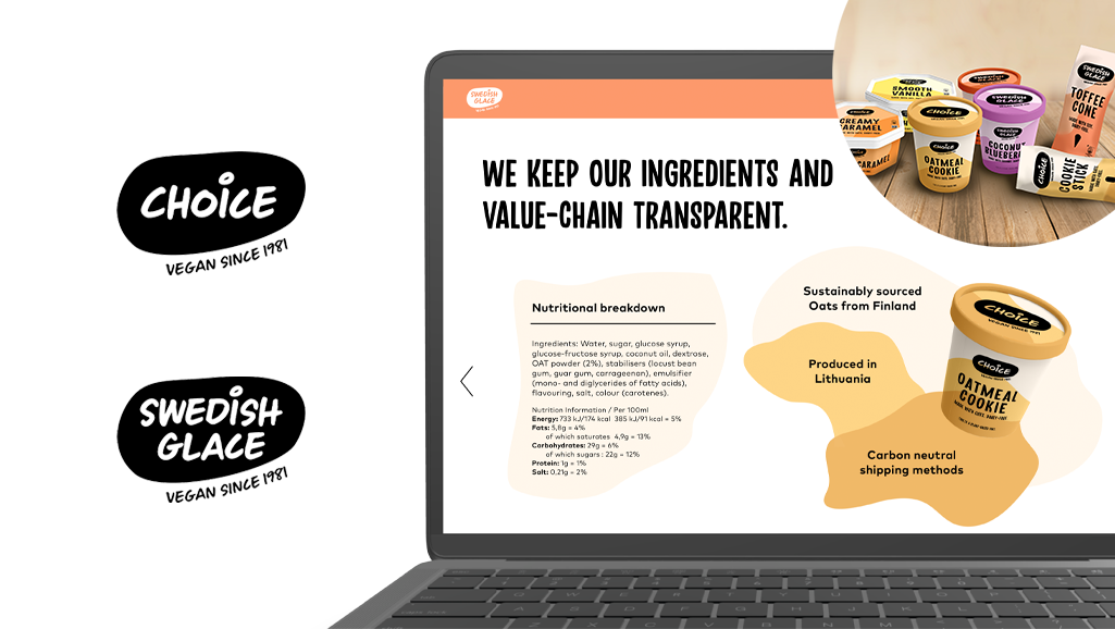
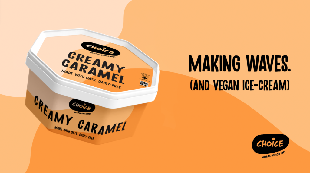
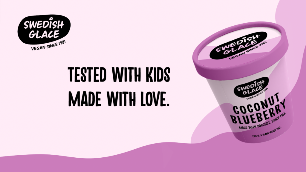
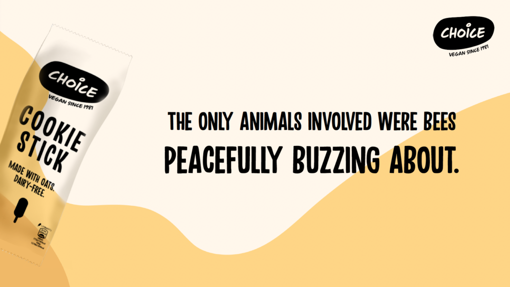
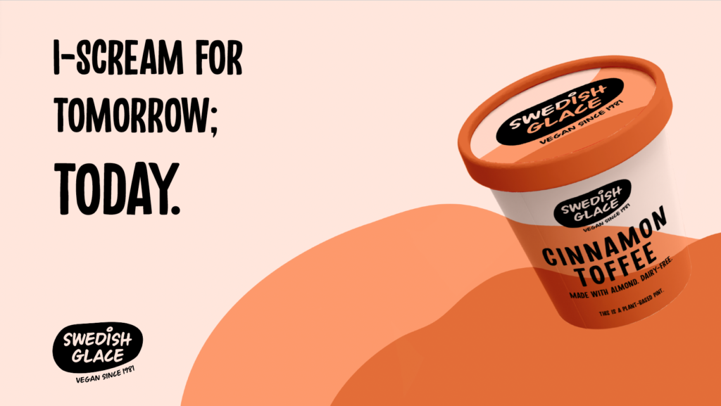
With a new logo comes a new packaging range — a versatile, playful, tasty and recognisable portfolio even without the logo. It’s representing a world of ice-cream, and enables a flexible yet consistent brand experience.


Why this design?
Because our biggest battle is category level, in-store, on-shelf, and our branding game must be strong. We make sure the information hierarchy helps deliver the key messages at quick glance. Also, the lid should appear with diversification by introducing the scalable colour pattern coming from the world map, and with the consistent curve treatment across formats and graphic elements on the impulse in order to indicate the types.
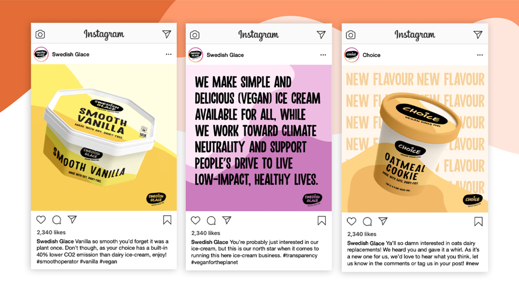
And that is just the beginning, we have drafted a 5-year road map together with the key stakeholders and that set a strategic plan which defines a goal or desired outcome and includes the major steps or milestones needed to reach it.
